Building a premium web presence for a luxury home builder from scratch
Meridian is a fictional Los Angeles custom home builder. I built
this as a concept project to show what a premium construction brand
website could look like. I also used it to learn Framer by building something real.
Project typeConcept / Spec
LocationLos Angeles, CA
IndustryLuxury Construction
DesignFigma
Built withFramer
Reading mode
Overview
Meridian is a fictional luxury custom home builder based in Los Angeles.
I built this as a concept project to show I could take a premium brand
from zero to a polished, client-ready website. That meant doing the full
process: user research, mood board, wireframes, and high-fidelity design.
I designed it in Figma and built the whole thing in Framer, which I was
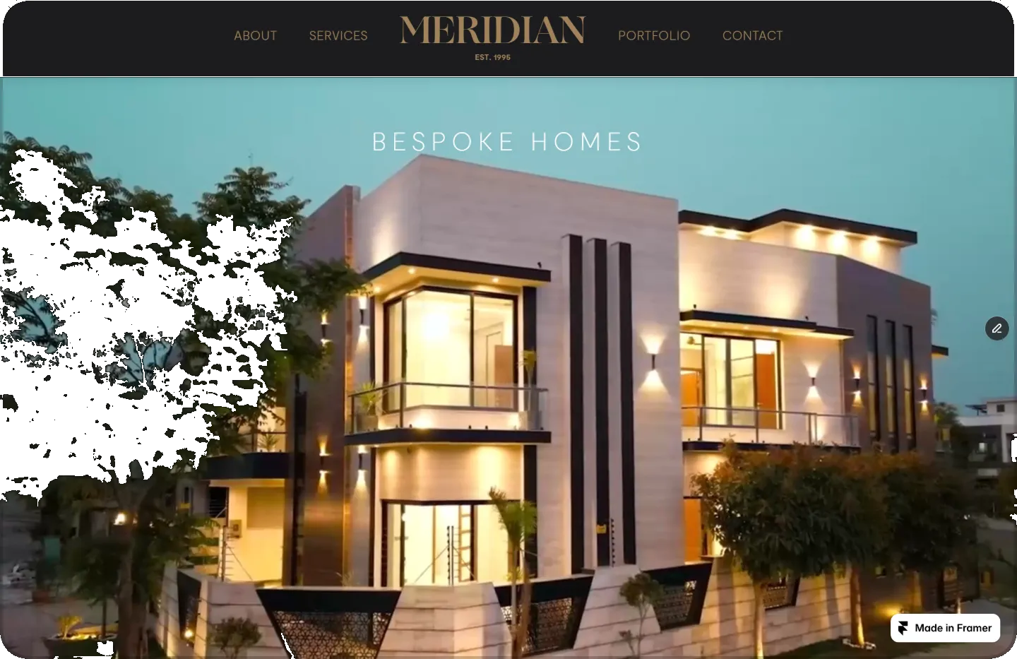
learning from scratch. The result is a dark, editorial web presence
that matches the brand's positioning: quiet confidence, uncompromising
craftsmanship, white-glove service.
My role
User persona research (3 personas)
Mood board and visual direction
Low and high-fidelity wireframes in Figma
Full Framer build from scratch
Scroll-triggered animations and interactions
Hero video preparation and optimization
CMS setup for portfolio case studies
Copywriting throughout
Key decisions
Research before design
Three detailed user personas shaped every layout and content decision. Understanding who hires a luxury builder determined the tone, the social proof strategy, and the service structure.
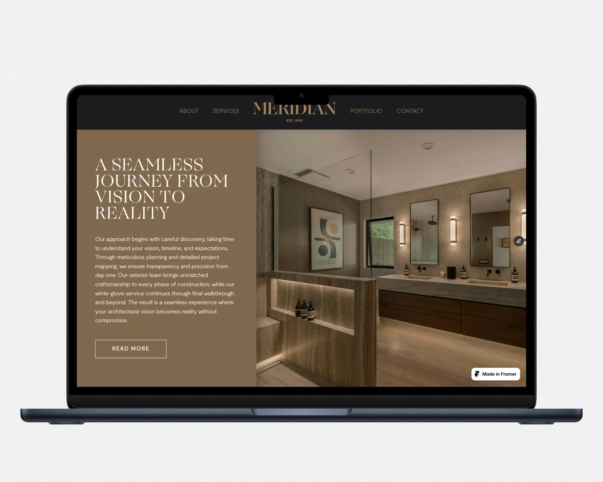
Grounded luxury aesthetic
Dark backgrounds, natural textures, and restrained typography. The site conveys premium positioning without flash. The work speaks. The design gets out of the way.
Sequenced scroll animations
The CTA section uses a precisely timed sequence: the image scales and fades in first, fully completes, then the heading appears. Motion that feels intentional, not decorative.
Video done properly
The hero uses a full-bleed background video. Learning to compress and format video for the web, balancing visual quality against load speed, was a deliberate part of this project's scope.
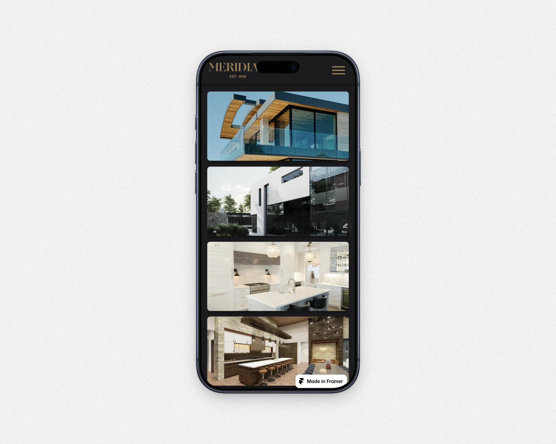
CMS-driven portfolio
The portfolio section is built on Framer's CMS, with a working case study demonstrating the full project page structure and narrative style.
Live site
Visit the finished site to see the full experience, including the
hero video, scroll animations, and CMS-driven portfolio.
The goal was straightforward but not simple: design and build a website
for a premium Los Angeles home builder that a real client could actually
receive and use without modification.
This was also a learning project. I had never used Framer before. Rather
than follow tutorials, I wanted to learn by building something real.
If it wasn't good enough to hand off to a client, it wasn't good enough.
That constraint shaped every decision. It pushed the research further,
the design tighter, and the build more carefully considered than a
typical tutorial exercise would have.
Research and user personas
Before touching Figma, I built three user personas to define
who Meridian's clients actually are. This wasn't just an exercise.
It shaped the tone of the copy, how much weight to give social
proof, the service structure, and the trust signals throughout the site.
The Tech Executive
Sarah Chen. CPO in Pacific Palisades. Limited time, complex modern design, needs clear communication and project management systems.
The Entertainment Couple
Marcus and Jennifer Whitfield. Beverly Hills. Jennifer has a precise design vision. Needs a builder who collaborates, not just executes.
The Established Owners
David and Catherine Rothstein. Bel Air. Building their forever home. Plan to travel during the build. Need absolute trust and responsive communication.
Each persona had distinct pain points and decision factors. The testimonials,
service descriptions, and process copy were all written to speak directly
to those three clients.
Visual direction
The mood board came before any layout work. I pulled references from
raw natural textures: dark stone, cross-cut timber. Contrasted against
clean architectural photography. Exposed concrete edges, warm wood slat
interiors, precise white kitchen finishes. A Rolls-Royce hood ornament
made the cut as a quiet nod to the calibre of client Meridian serves.
The visual language that emerged was grounded, quiet luxury. Not flashy.
Confident.
That direction became the brief for everything in Figma: dark backgrounds,
warm neutral tones, generous whitespace, editorial photography, and
typography that felt considered without drawing attention to itself.
Wireframes
With the visual direction locked, I moved into low-fidelity wireframes in
Figma for the homepage and about page, across both desktop and mobile.
This phase was about hierarchy and flow. Where does the eye go first.
How does a visitor move from the hero to the services section to social
proof and then to contact. Getting the mobile layout right at low fidelity
saved significant time later in the build.
From low-fidelity I moved into high-fidelity: adding typography, spacing,
image placement, and component design before a single element was built
in Framer.
Desktop — editorial layout
Mobile — streamlined navigation
Building in Framer
Learning a new platform by building something real
I had never used Framer before this project. I wanted to learn it by
building something with real stakes, not following along with tutorials.
That approach is slower at the start and faster at the end. Every
problem you hit is a real problem with a real consequence for the output.
The component and variant system was the first thing to figure out. Framer's
approach is similar to Figma's, so that helped. Once the components were
in place, the rest of the build moved quickly.
Animations
Motion that earns its place
The hardest animation on the site was in the CTA section near the bottom
of the homepage. The requirement: an image scales down and fades in on
scroll. Only after that animation fully completes does the heading above
it appear.
Getting the timing and sequencing right in Framer took real iteration.
The result is motion that most visitors won't consciously notice. Which is exactly the point. Animation should feel inevitable, not decorative.
Scroll triggers
Animations tied to scroll position, not page load. The page reveals itself as you move through it.
Sequenced timing
The image animation completes fully before the heading appears. Order and timing were iterated until the sequence felt natural.
Components and variants
Reusable components with Framer variants handled interactive states cleanly across the site.
CMS integration
The portfolio section uses Framer's CMS. The Travertine Sanctuary case study shows how the full project page structure works.
Video for the web
Performance is part of the design
The homepage hero uses a full-bleed background video. Getting that right
on the web is more involved than it looks. Too heavy and the page loads slow.
Too compressed and the premium feel is gone on the first frame.
Learning to prepare video for the web, finding the right format and
compression settings, and how to balance visual quality against load
speed, was a deliberate part of this project's scope. It's a skill
that carries into every project with video content going forward.
The persona work was the part that mattered most and the part easiest
to skip. Doing it first made every design decision easier. When you know
who you're designing for, there's less guessing. The tone of the copy,
the weight of the testimonials, the emphasis on the build process. All
of it came directly from understanding those three clients.
Learning scroll-triggered animations taught me that motion has to feel
deliberate. A single animation that fires at the wrong moment can cheapen
an entire page. Getting the sequencing right takes patience.
And preparing video for the web turned out to be a skill of its own.
It pays off every time a page loads clean and fast with content that
still looks like it belongs on a premium site.