Giving a cinematographer the presence his work deserved
Mat Harvey shoots for brands like Echelon and Back & Forth.
His Instagram told part of the story. This project made sure the
full picture was impossible to miss.
ClientMat Harvey
LocationCalgary, AB
IndustryCinematography
DesignFigma
Built withAstro, Cursor
Reading mode
Overview
Mat Harvey is a Calgary-based cinematographer whose work spans brands,
community events, and travel. He had no website, no clear positioning,
and rates that didn't reflect the quality of his output. The goal was
to fix all three at once.
I designed the site in Figma and built it in Astro using Cursor with
AI-assisted development. The result is a dark, cinematic portfolio that
lets his video work lead, positions him for higher-value clients, and
gives him a professional presence that his social media couldn't.
My role
Brand strategy and positioning
Client discovery and questionnaire
Figma design and moodboard
User personas for target clients
Full Astro build with Cursor
Video editing: 4 hero compilations
Vimeo integration and performance tuning
Mobile-first UX with reel-style scroll
Card fan featured work interaction
Copywriting throughout
Key decisions
Positioning first
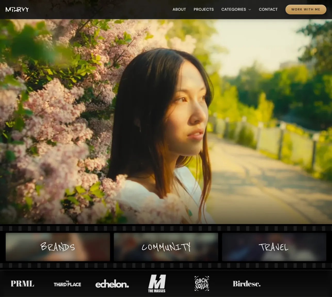
Helped Mat narrow his focus from photography and videography to solely cinematography across three clear categories: Brands, Community, and Travel.
Cinema as the design language
Dark, restrained aesthetic with a film strip layout on desktop and TikTok-style reel scroll on mobile. The site feels like the work.
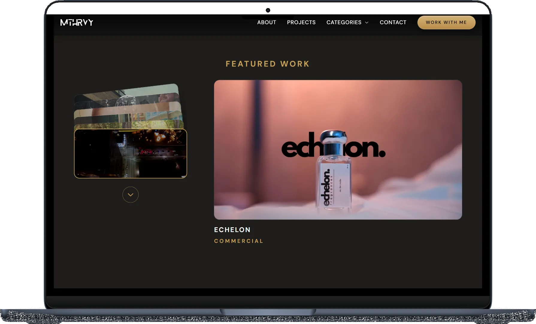
Card fan featured work
A stacked card fan lets visitors cycle through projects. The active project expands large on the right with its title and category. Engaging without being gimmicky.
Video-first performance
Vimeo for project videos, native files for heroes. Lazy loading and poster frames kept pages fast across heavy video content.
Built for better clients
Scrolling client logo bar and a budget-gated contact form signal premium positioning from the first scroll.
From Mat
"Rich is super chill to work with. He really takes the time to
understand your story so he can match the website to your
personality and brand. Now I feel more confident because I actually
have a solid portfolio to show clients whenever they ask. I've even
had a few creatives ask who built my site, so that says a lot about
the quality of Richard's work."
MHMat HarveyCinematographer, Calgary AB
Live site
Visit the finished site to see the full experience, including the
hero videos and mobile reel scroll.
Mat Harvey is a Calgary-based cinematographer with a growing social
media following and a client list that includes recognizable local and
regional brands. His referral network was bringing in work, but there
was no single place where someone could go, watch his work in full,
understand what he does, and decide to hire him.
He was also disorganized with his past work. Finding the right project
to show a potential client meant digging through files he hadn't
properly catalogued. Instagram and TikTok scatter attention. A brand
partnership or agency inquiry deserves more than a scroll through a feed.
Mat needed a dedicated professional home that matched the calibre of
his output and could convert serious prospects into paying clients.
There was also a positioning problem. At the start of the project,
Mat's portfolio spanned videography, photography, and community events
with no clear narrative. Before a single line of code could be
written, that needed to be resolved.
Discovery and strategy
The first meeting wasn't about design. It was about understanding Mat
as a creative and as a business. Through a structured questionnaire
and conversation, one thing became clear: Mat had a rare ability to
capture personality through his lens, not just scenes. That was the
through-line. But it wasn't something he had fully articulated yet,
even to himself.
The path forward was to strip the noise and focus the site entirely
on cinematography, organized into three categories that reflected
where his strongest work already lived.
Brands
Commercial and lifestyle work for businesses that need their story captured with intention.
Community
Event and documentary-style work rooted in Calgary's creative scene.
Travel
Destination and landscape work capturing places and the people within them.
User personas
Understanding who Mat actually needed to reach
Part of the moodboard process involved building out user personas for
Mat's target clients. This isn't something most web developers do, but
it matters. If you don't know who you're designing for, you're just
guessing at what the site needs to say and how it needs to feel.
Four personas came out of that process, each representing a real type
of client Mat was already working with or trying to attract.
MC
Lifestyle creator
50k–300k followers, brand deals, Alberta based. Needs a cinematographer who gets the creator world without lengthy briefs. Budget: $3k–6k.
JT
Community organizer
Founder of a cultural event or growing organization. Needs someone already embedded in the community who captures real crowd energy. Budget: $3k–6k per event.
SL
Brand manager
Works at a larger lifestyle or travel brand. Needs a collaborative partner who can brief once and trust. Mat's Travel Alberta work is the proof point. Budget: $4k–10k.
NK
Regional marketing lead
National lifestyle brand with Alberta operations. Wants agency-level output from a local, agile operator. Professionalism and reliability over hand-holding. Budget: $6k–15k.
These personas shaped everything from the copy tone to the contact
form structure. The budget selector on the form isn't just a filter,
it's a signal to the right people that Mat works at a certain level.
The Travel Alberta credit sits prominently in the client logo bar
because for the brand manager and marketing lead personas, that one
name does a lot of the qualifying work before a single conversation happens.
Design direction
A moodboard came before any layout decisions. For Mat's site, the
direction was warm, premium, and intentionally restrained. The work
needed to lead. Everything else needed to get out of the way.
Cinema was the reference point throughout. The way a film
communicates atmosphere before a single word of dialogue, that was
the standard. Dark, neutral backgrounds give his videos room to
breathe and stand out. Typography was kept minimal. The layout gave
primacy to moving image at every turn.
"Just like how a lot can be said in movies without words, the same
would be true for the website. I wanted his work to speak for him."
Desktop — film strip layout
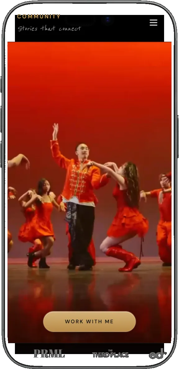
Mobile — reel scroll
The hardest part
Four hero compilations from 25 source videos
Mat had roughly 25 source videos across his categories. None of them
were formatted for the web as hero content. A two-minute event film
doesn't function the same way as a short compiled reel designed to
capture attention in the first few seconds.
Each category needed its own compiled hero video cut to communicate
the feel of that section immediately. A fourth was cut for the
homepage. Watching through all 25 videos, selecting the right
moments, and editing four compilations from scratch took two full days
and was the most unexpected part of the project scope. It was also
the most impactful part of the final result.
Technical challenges
Getting that much video onto a site without killing performance
required solving several problems at once. The biggest decision was
how to host and serve the videos. Hosting natively wasn't viable at
that volume, so Vimeo handled the main project videos. But Vimeo
embeds come with a load time tradeoff. Getting them to initialize
quickly enough to feel seamless required careful handling of embed
parameters, lazy initialization, and sequencing what loaded when.
For the hero compilations, Vimeo introduced noticeable lag on the
most important part of the page. Native video files were used there
instead. Every page ended up with a slightly different delivery
approach, and finding that balance was one of the more technically
demanding parts of the build.
Video hosting strategy
Vimeo for project videos, native files for heroes. Each served a different purpose and needed a different delivery approach.
Load performance
Lazy loading, poster frames, and careful sequencing kept pages fast across every section.
Quality vs. speed
Every video decision involved weighing visual fidelity against load time. No single answer worked everywhere.
Astro's static output
Zero unnecessary JavaScript shipped to the browser, keeping baseline performance high before any optimization work.
Desktop and mobile
Two distinct experiences, not one resized layout
On desktop, the three category sections on the homepage are presented
in a film strip format. The framing is a direct nod to Mat's medium
as a cinematographer and gives the homepage a distinctive visual
identity that most portfolio sites don't bother developing.
On mobile the experience shifts entirely. Category pages use a
TikTok-style vertical reel scroll for browsing through videos. Mat's
audience finds him on social media and is already fluent in that
interaction pattern. Rather than fight that habit, the mobile
experience leans into it. Eyes stay on the work, friction disappears,
and browsing feels native to the device.
Featured work interaction
A card fan that makes browsing feel like flipping through a portfolio
The featured work section needed to do more than display a grid of
thumbnails. Mat's projects each have their own mood and story, and a
flat grid treats them all the same. The solution was a stacked card
fan on the left side of the section: project thumbnails layered on top
of each other at slight rotations, like a hand of cards or a stack of
prints on a table.
As a visitor cycles through the stack, the active project expands into
a large display on the right with the project title and category label
beneath it. The interaction is tactile and deliberate. It slows the
visitor down in the right way, giving each project a moment to land
before moving to the next. Engaging without being a gimmick, and
it fits the cinematic, considered tone of the rest of the site.
What was delivered
Full custom website designed in Figma and built in Astro
User personas for four target client types
Four compiled hero videos from 25 source videos
Film strip desktop layout and reel-style mobile scroll
Card fan featured work interaction
Vimeo integration with native video fallback for heroes
Performance tuning with lazy loading and poster frames
This project was built using Cursor, an AI-powered code editor, as
part of my standard development workflow. I want to be upfront about
that because I think it's a strength worth talking about, not
something to hide.
Using Cursor didn't mean the work was done for me. The design
thinking, the creative decisions, the video editing, the brand
strategy, the problem-solving around video performance — none of that
changes. What AI-assisted development does is compress the gap between
a decision being made and that decision showing up in the browser.
When I figured out the right approach for lazy-loading the Vimeo
embeds, I could implement and test it faster. When I needed to iterate
on the mobile reel layout, I could move through variations quickly
without getting bogged down in syntax.
For a client like Mat, that speed matters. It means fewer days waiting
for revisions and a shorter path from approved design to live site. AI
is a tool in the same way Figma is a tool. It doesn't design the site.
It helps me build what I've already decided to build, faster and with
more room to iterate. Every line of code in this project was reviewed,
understood, and intentional.
From Mat
"Rich is super chill to work with. He really takes the time to
understand your story so he can match the website to your
personality and brand. Now I feel more confident because I actually
have a solid portfolio to show clients whenever they ask. I've even
had a few creatives ask who built my site, so that says a lot about
the quality of Richard's work."
MHMat HarveyCinematographer, Calgary AB
Reflection
This project pushed into territory I hadn't worked in before,
specifically the video editing side. Cutting four hero compilations
from 25 source videos was unexpected scope and took longer than
almost anything else. But it ended up being the most important part
of the build. Without those reels, the site wouldn't land the same way.
The most satisfying part wasn't the finished site. It was watching a
creative who struggled to articulate what made his work different walk
away with a clear sense of direction and a web presence that finally
reflected it. The site is doing what it was built to do: letting the
work make the argument.